
Case Studies

Improving user experience on a website for foodies and cooking enthusiasts.
I worked on the overall design process and oversaw aspects related to product scoping, user flows, wireframes, rapid prototyping and usability testing.
MY ROLE
10 days
Individual
Figma, Discord, Zoom, Adobe Photoshop, CSP
TOOLS
TIMELINE
PROJECT SCOPE
BEFORE WE BEGIN,
LET'S DELVE INTO THE REASON WHY A REDESIGN IS NEEDED
As a designer, it is important for us to conduct contextual inquiry — a vital research method in UI/UX design that allows us to gain deep insight into users' needs and behaviours.
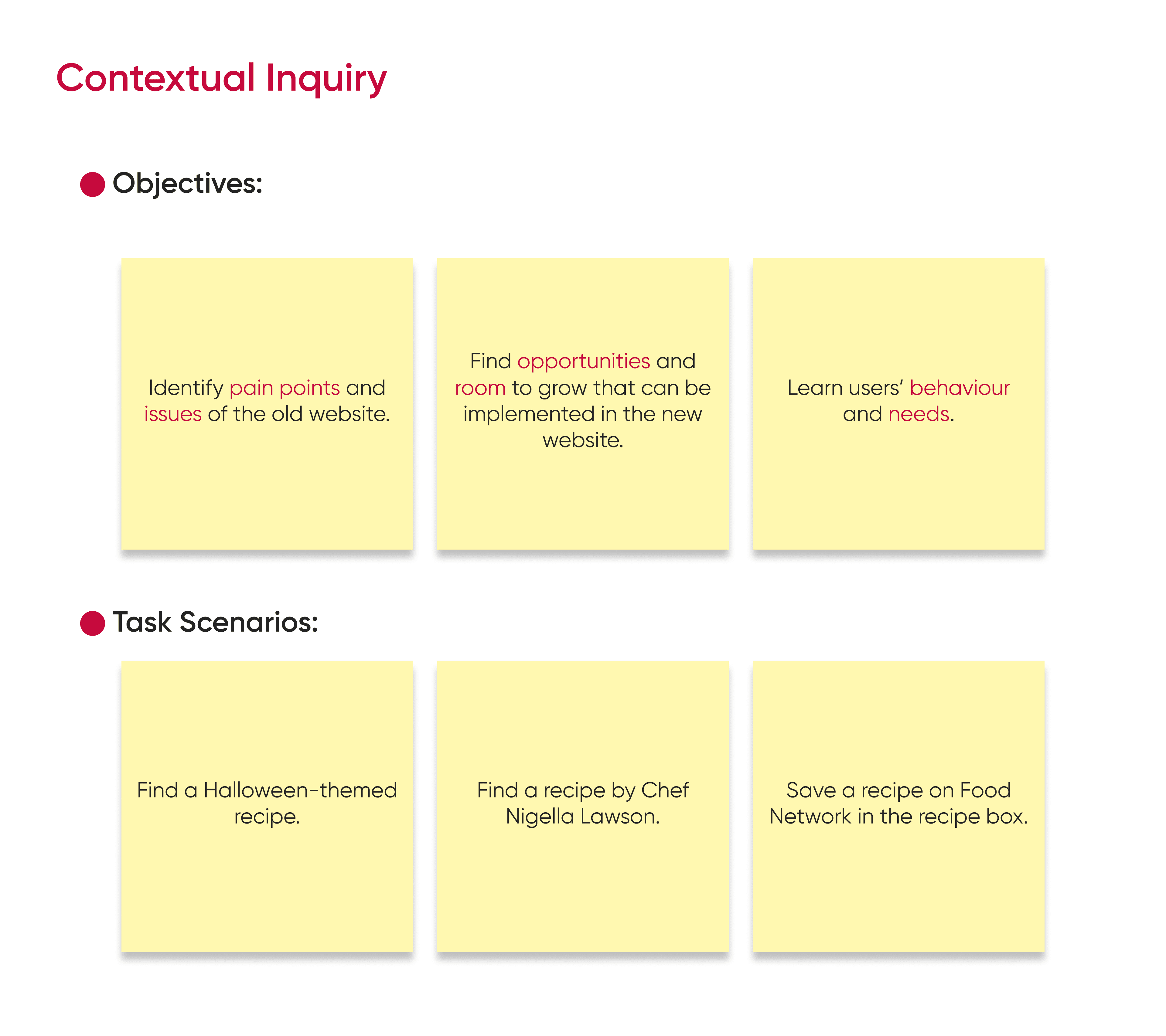
By observing users in their natural environment and engaging in meaningful conversations, we can uncover pain points, preferences, and workflow challenges. This valuable context helps shape user-centered interface that enhance usability and overall satisfaction, ultimately leading to a more effective digital experience.
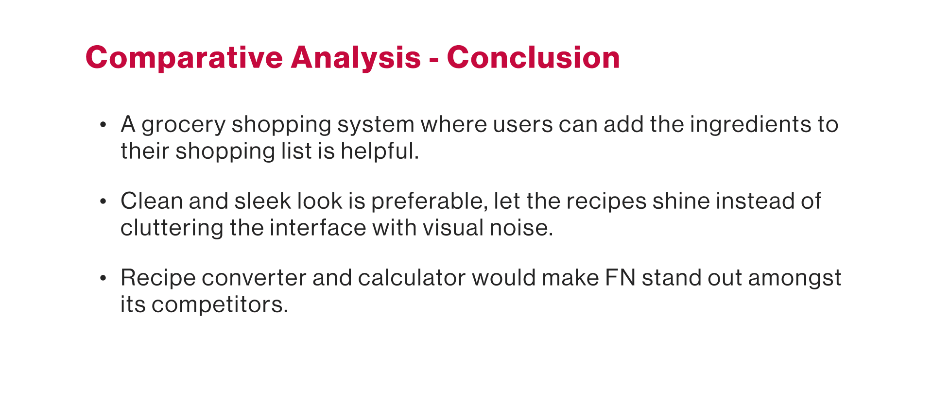
We then confucted a comparative research that involves analyzing and evaluating similar food and cooking websites to gain valuable insights and inspiration. By studying the strengths and weaknesses of the competitor's platforms, I can identify trends, best practices, and innovative features that can be adapted to enhance the Food Network's user experience.
This research approach informs decision-making, ensuring that the redesigned website not only meets industry standards but also stands out with unique and engaging elements that cater to the culinary community and food enthusiasts.
NOW THAT WE KNOW WHY,
LET’S THINK OF WHAT NEEDS TO BE DONE
After conducting thorough research for the Food Network website redesign, the process of distilling user persona begins. By synthesizing the data and insights gathered from user interviews, surveys, and usability testing, a distinct user persona emerge.
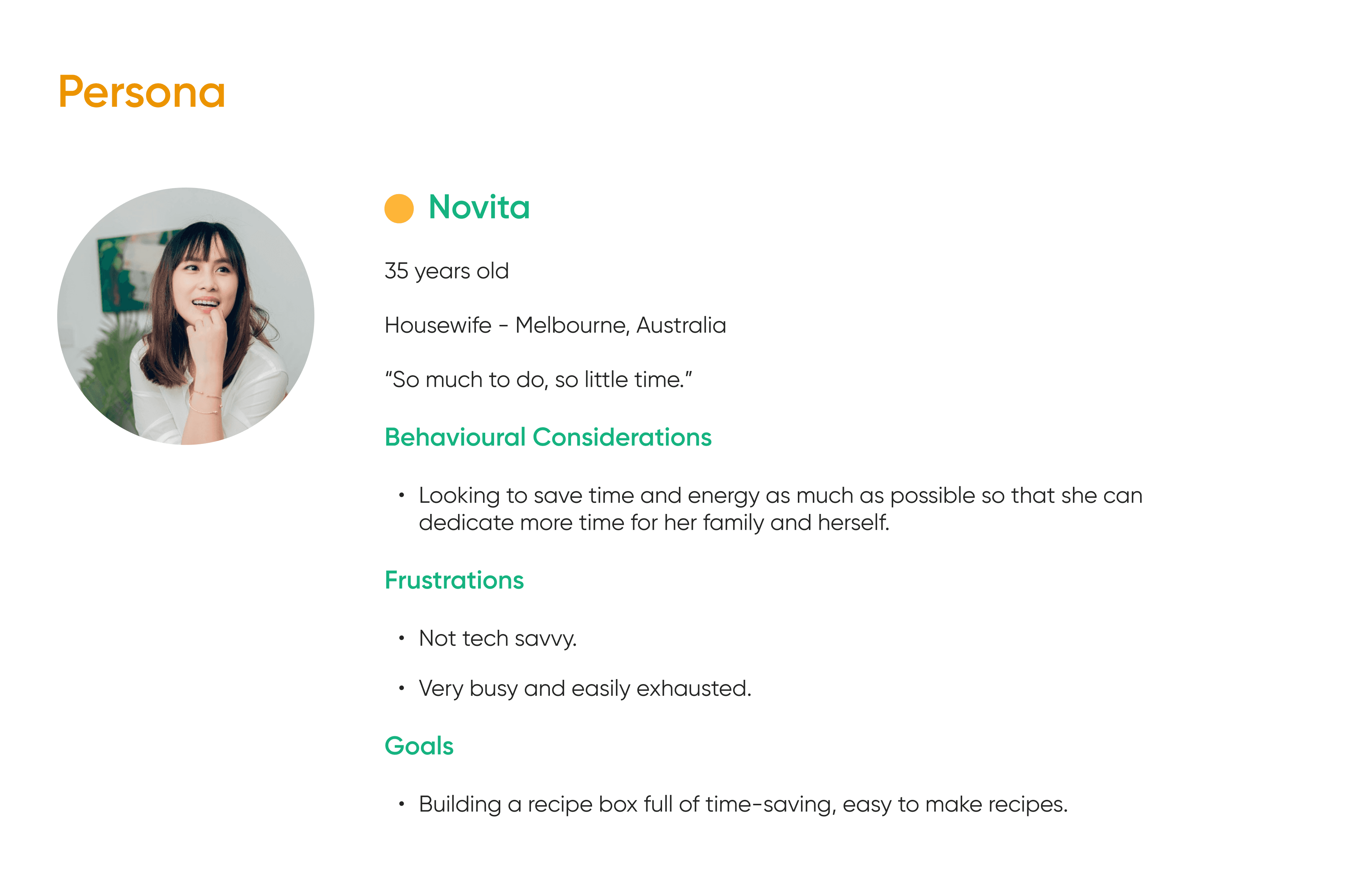
This user persona provides a clear framework for tailoring the website's content, features, and design to cater to the audience effectively, ensuring a more personalized and engaging user experience.
HOW ARE WE GOING TO SOLVE THESE PROBLEMS?
Using the data collected from our extensive research, we are analyzing user feedback, behavior patterns, and preferences to identify pain points and opportunities for improvement.
Data-driven insights inform my decisions about layout, navigation, content strategy, and interactive elements — ensuring that the redesigned website aligns with user needs and expectations. This evidence-based approach leads to more informed design choices, enhancing the design's usability, engagement, and overall user satisfaction to create a more compelling digital culinary experience.
NOW, LET’S GET COOKING!
HI-FI DESIGN
Here comes the hi-fi design — the result of meticulous research, creative vision, and user-centric principles. This design represents a harmony of aesthetics and functionality, carefully crafted to elevate the culinary journey for every user.
With a clean and intuitive interface and seamless navigation, it brings a fresh and inviting feel to the world of cooking and culinary exploration. From passionate home cooks to seasoned chefs, this design aims to inspire, educate, and delight.
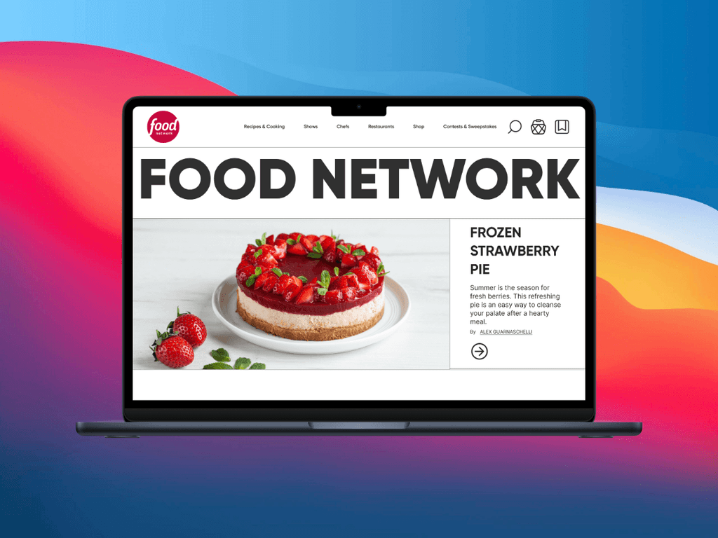
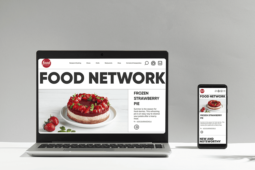
HOME PAGE
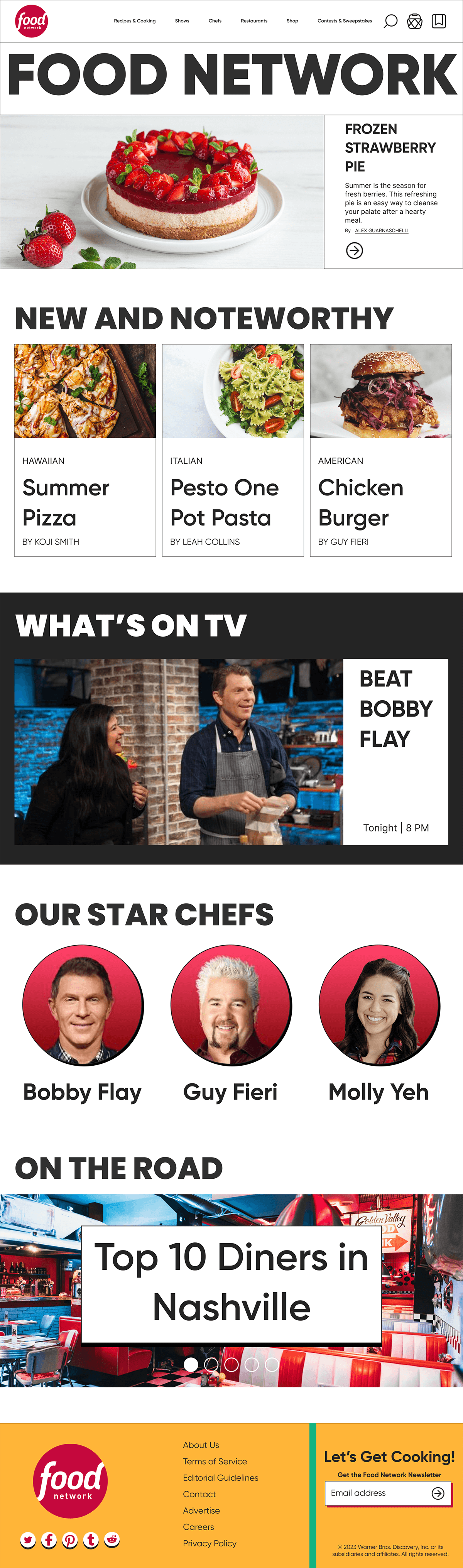
We removed the unnecessary information and only kept the crucial ones. If people click on the headers, they’ll be directed to the page that contains more information on that topic. For example, more chefs. The footer is designed after food packaging.
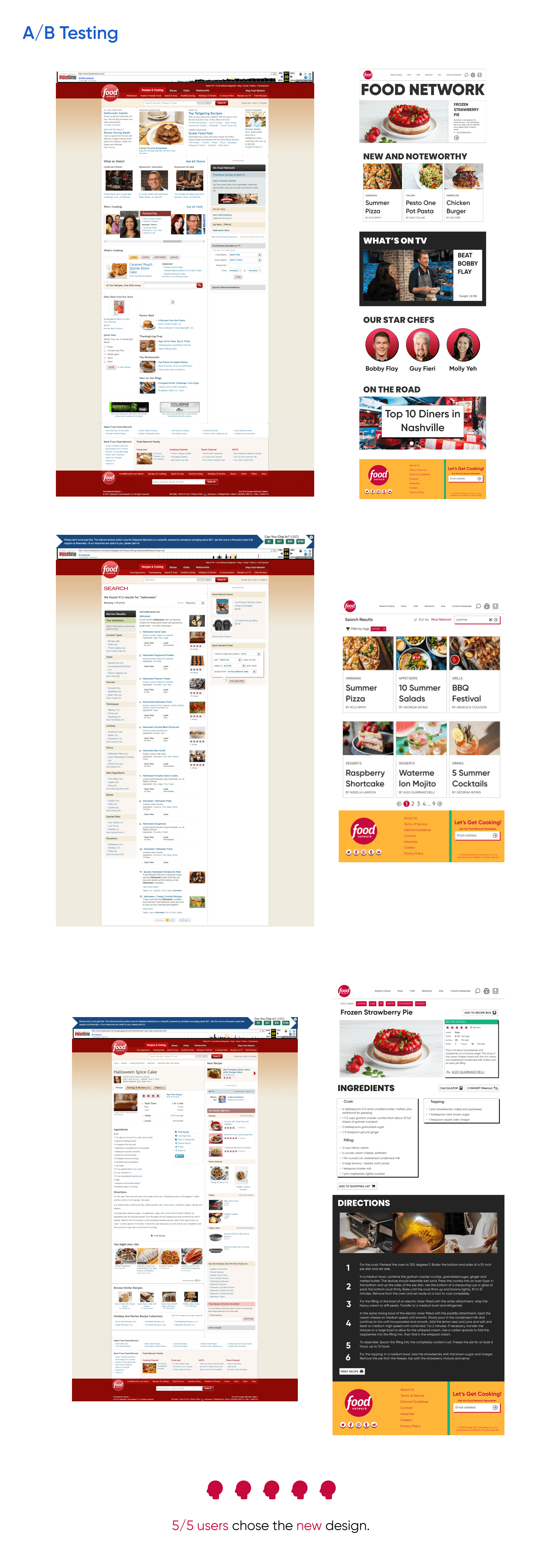
SEARCH PAGE
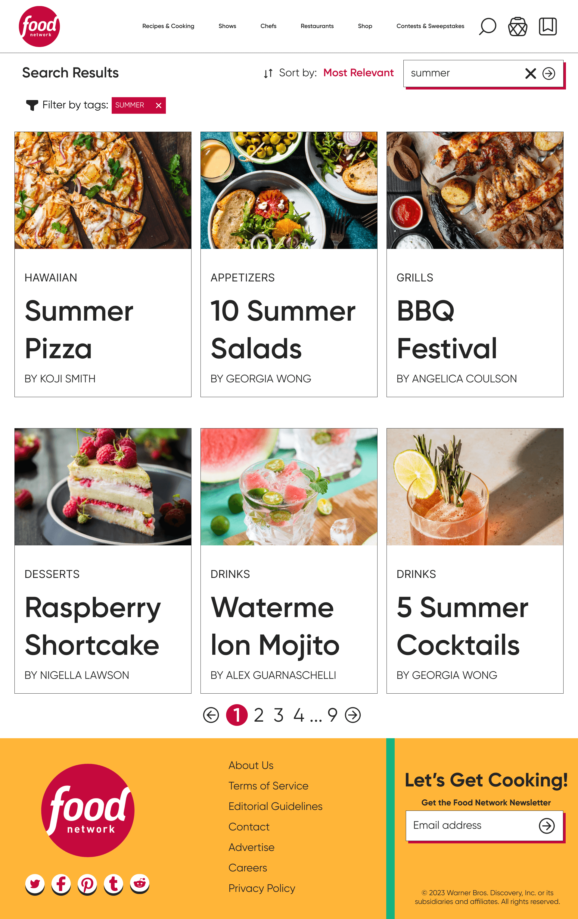
Instead of chunks of text, the search page is now equipped with pictures in the form of cards. This makes it easier for users to skim through the pages and find a recipe that they feel interested in. Users can also filter the search results by tags.
RECIPE PAGE
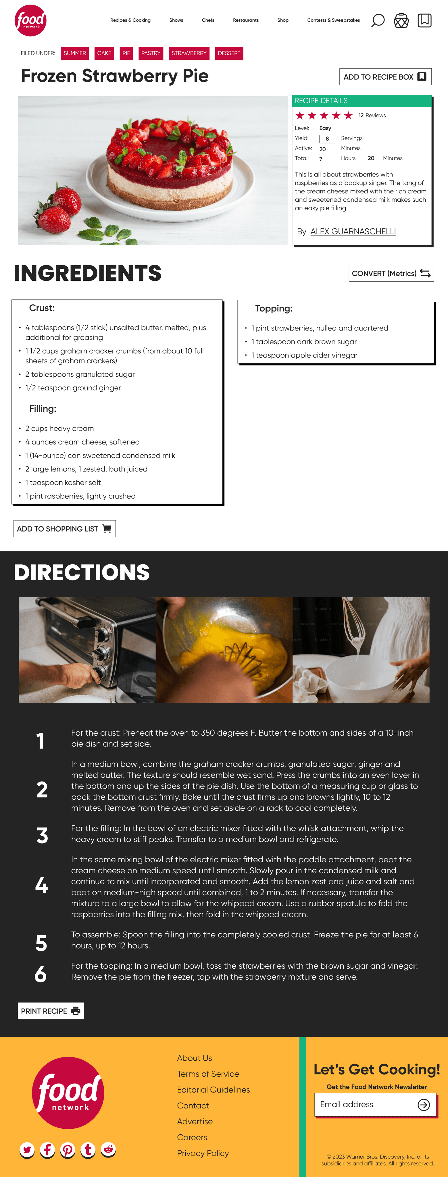
The individual recipes are now dominated by pictures than just text.
We added a button to convert the recipe to different measurements. We also changed the way directions are presented, with the bold and big numbers to represent the steps, and separate each step better.
EXAMPLE OF WHEN THE CALCULATOR FEATURE IS USED

RECIPE BOX PAGE
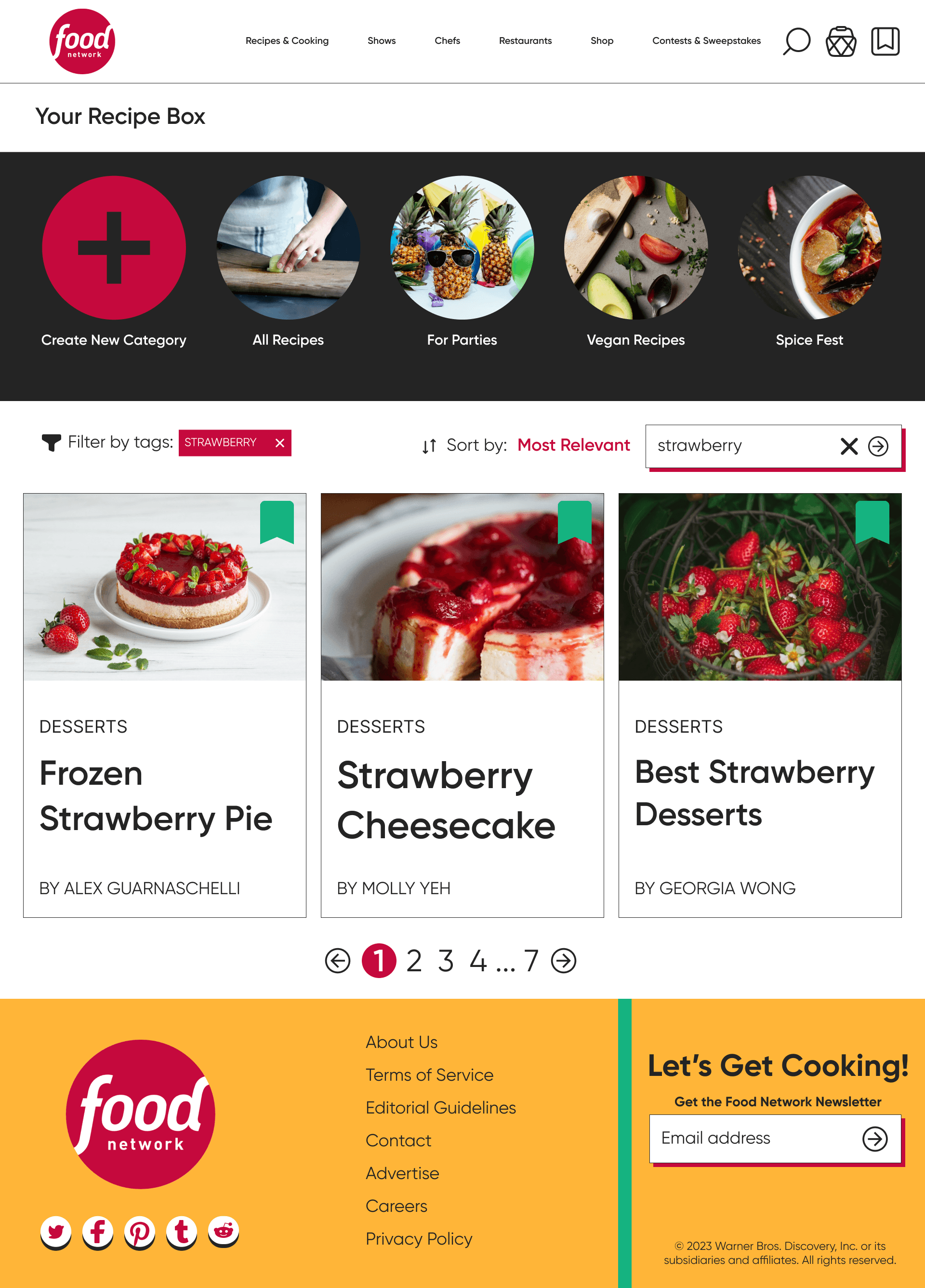
We added a category system that users can use to further categorize their saved recipes freely. Users can easily unsave a recipe by clicking on the bookmark button on the top right.
PROTOTYPE
RESPONSIVE MOBILE DESIGN
In order to accommodate a broader audience, we've revamped the mobile iteration of the Food Network site. As the reliance on smartphones grows daily, we aim for our redesign to appeal to a larger user base and satisfy more users.
HOWEVER — DOES IT REALLY WORK?
In order to see whether our redesign is a success, we conducted a brief A/B Testing. The users from our previous interview were asked to compare between the old design and the new design.
The redesigned Food Network website is a proof that user-centered design is key. Through meticulour research, thoughtful user persona, and data-driven decisions, I have transformed a digital space into a culinary haven. It's more than just a website — it's a reflection of my commitment to making cooking and food discovery more accessible, enjoyable, and tailored to every user's needs.
The most important takeaway from this project is that when design meets user insights, it will result in an engaging, informative, and delicious online experience that resonates with food enthusiasts of all kinds.
PROJECT TAKEAWAYS
OTHER PROJECTS: