
Case Studies
End-to-end redesign for a peer-to-peer lending app.
KoinWorks is a peer-to-peer lending platform, founded in 2016.
It aims to provide solution and accessibility for various financial needs in one application.
KoinWorks is also created with the belief that anyone and everyone can realize their financial goals and manage their money easily.
INTRODUCTION
I worked on the overall design process and oversaw aspects related to product scoping, user flows, wireframes, rapid prototyping and usability testing.
MY ROLE
10 days
Individual
Figma, Discord, Zoom, CSP
TOOLS
TIMELINE
PROJECT SCOPE
FIRST, LET'S LEARN WHY A REDESIGN IS NEEDED
Most people desire to generate income, yet they lack certainty regarding suitable investment opportunities.
KoinWorks is an app intended to be the solution to such problem.
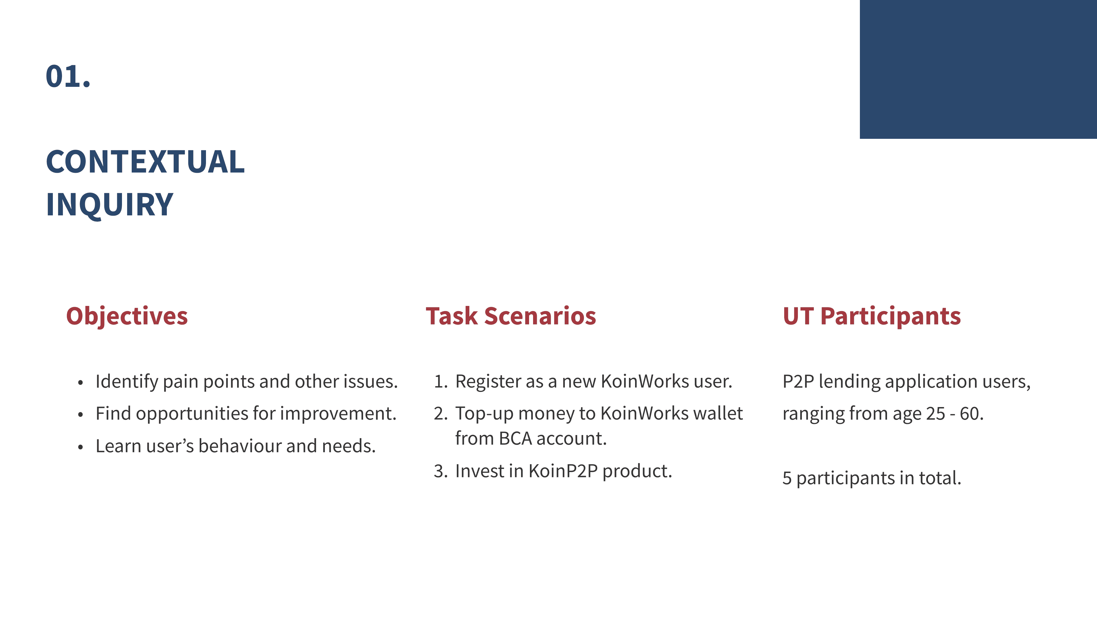
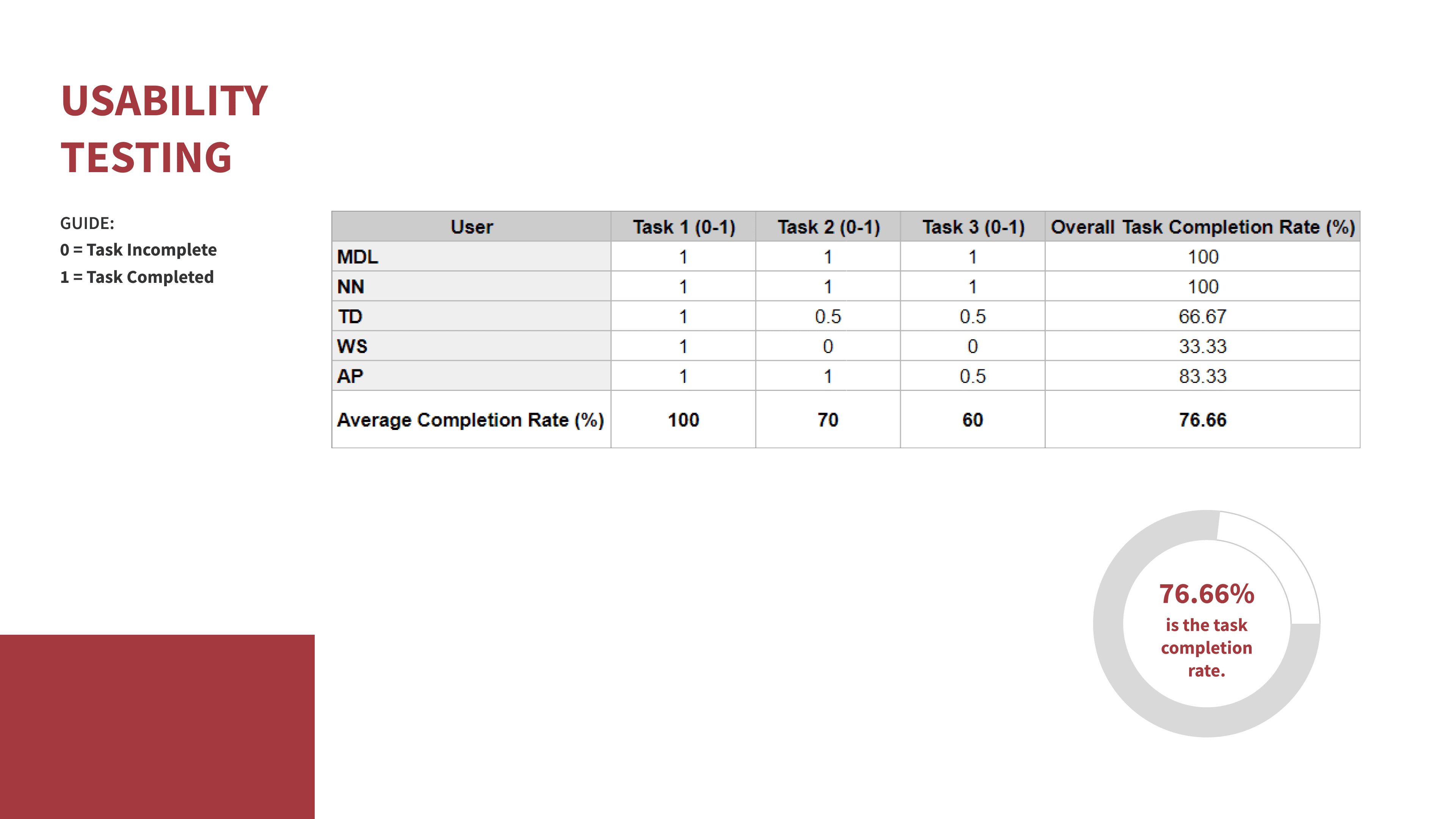
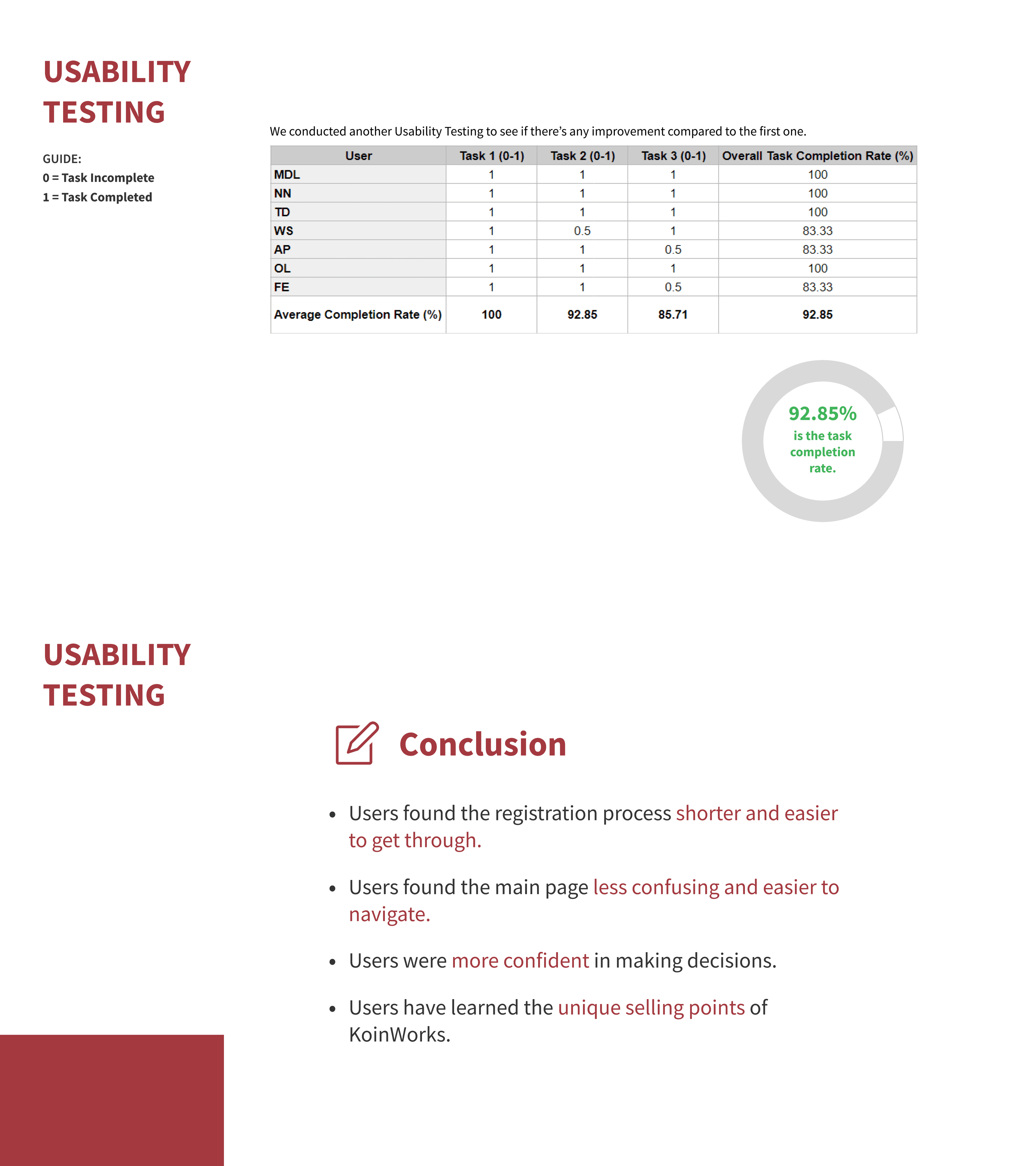
However, while conducting usability testing, we discovered that:
Users find the registration process long and dry. Many end up skipping through the onboarding pages in order to get the job done.
Users get distracted by the various buttons and links on the page, and ended up browsing through the page for a while before finally clicking the targeted buttons.
Users felt unsure of which buttons to press due to the inconsistencies among button styles and other visual elements.
Users missed the unique selling points of KoinWorks, such as money back guarantee (provisions) and the auto-invest feature.
We also conducted a desktop research to learn more about other peer-to-peer lending apps.
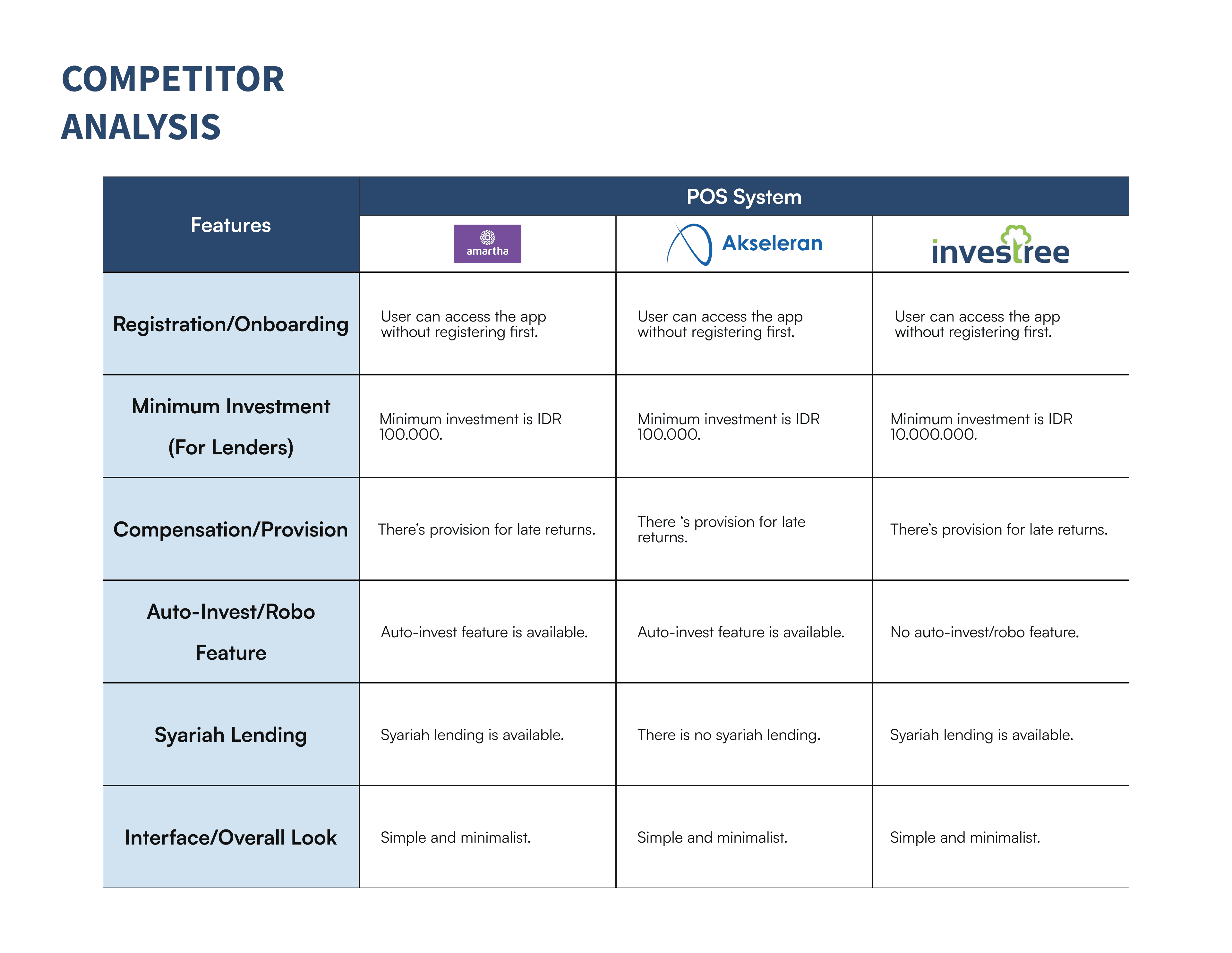
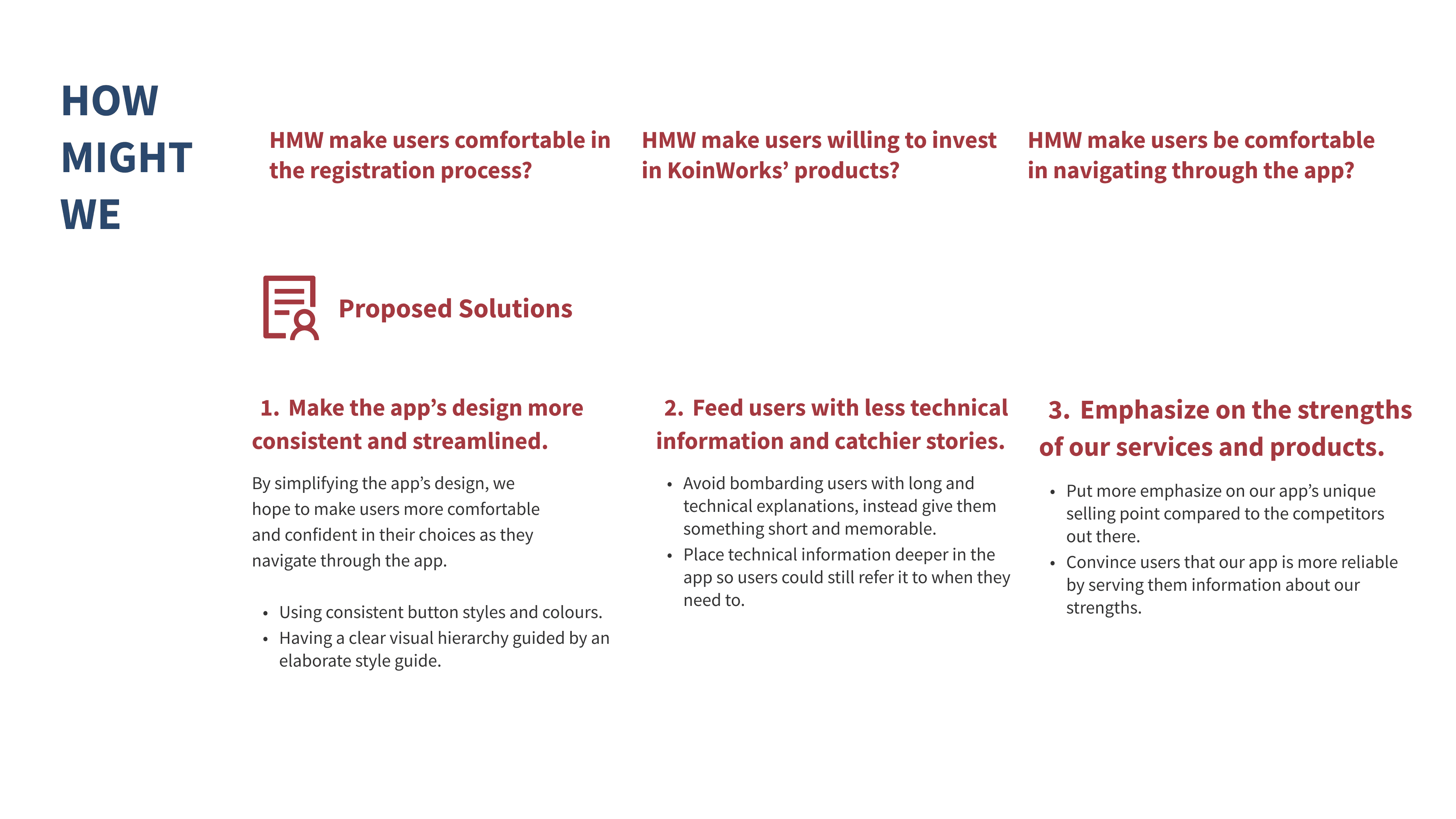
From the user interview and comparative analysis, we asked several questions:
HMW make users comfortable in the registration process?
HMW make users willing to invest in KoinWorks’ products?
HMW make users be comfortable in navigating through the app?
In order to resolve those questions, we distilled a user persona based on the data we've gathered.
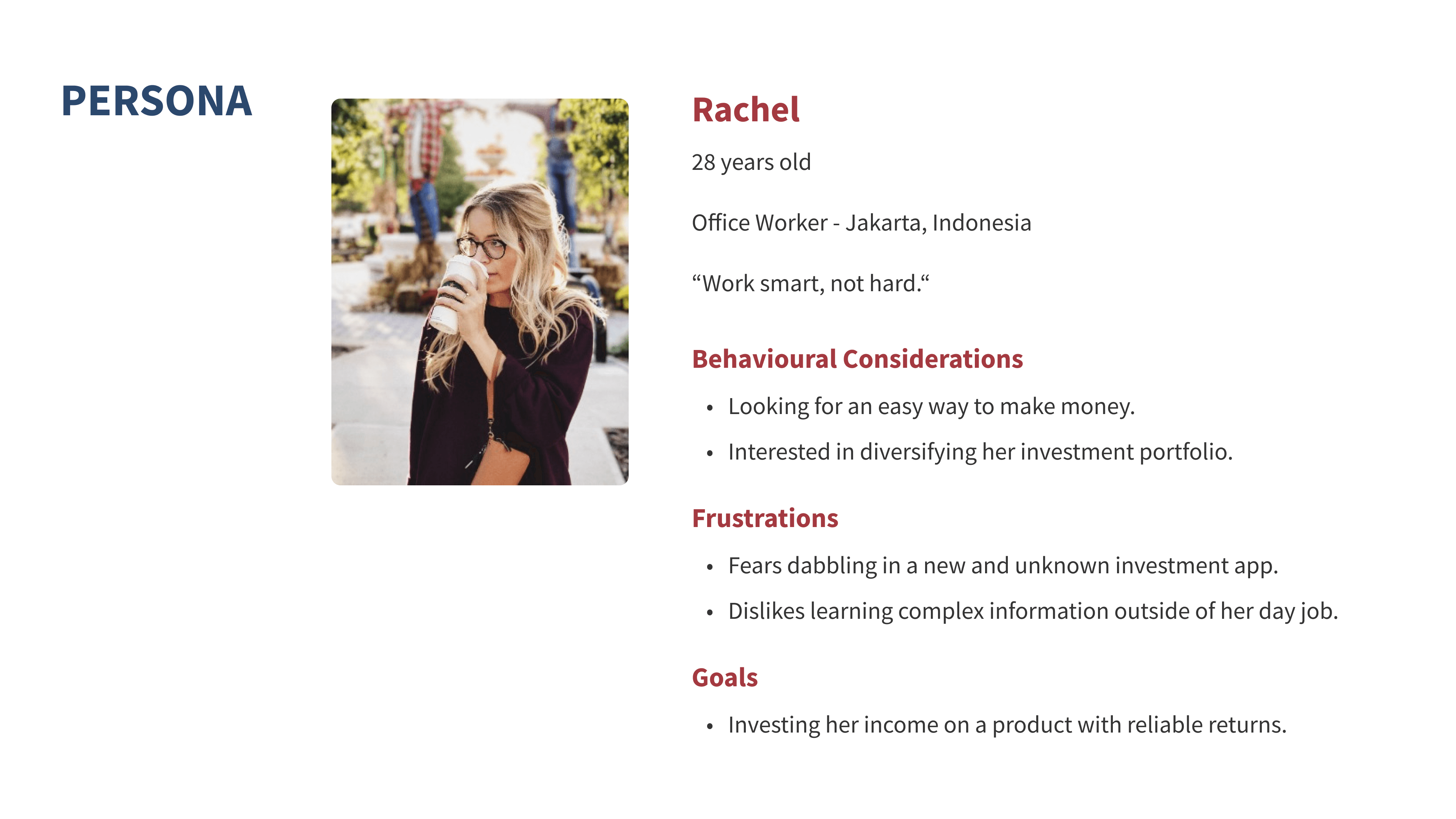
Placing said persona in an ideal context scenario helps identify what needs to be redesigned and prioritised. Our primary goal at the moment is to extract a list of design requirements that we have to support in order for these ideal scenarios to happen. These requirements would then lead our idea generation phase.
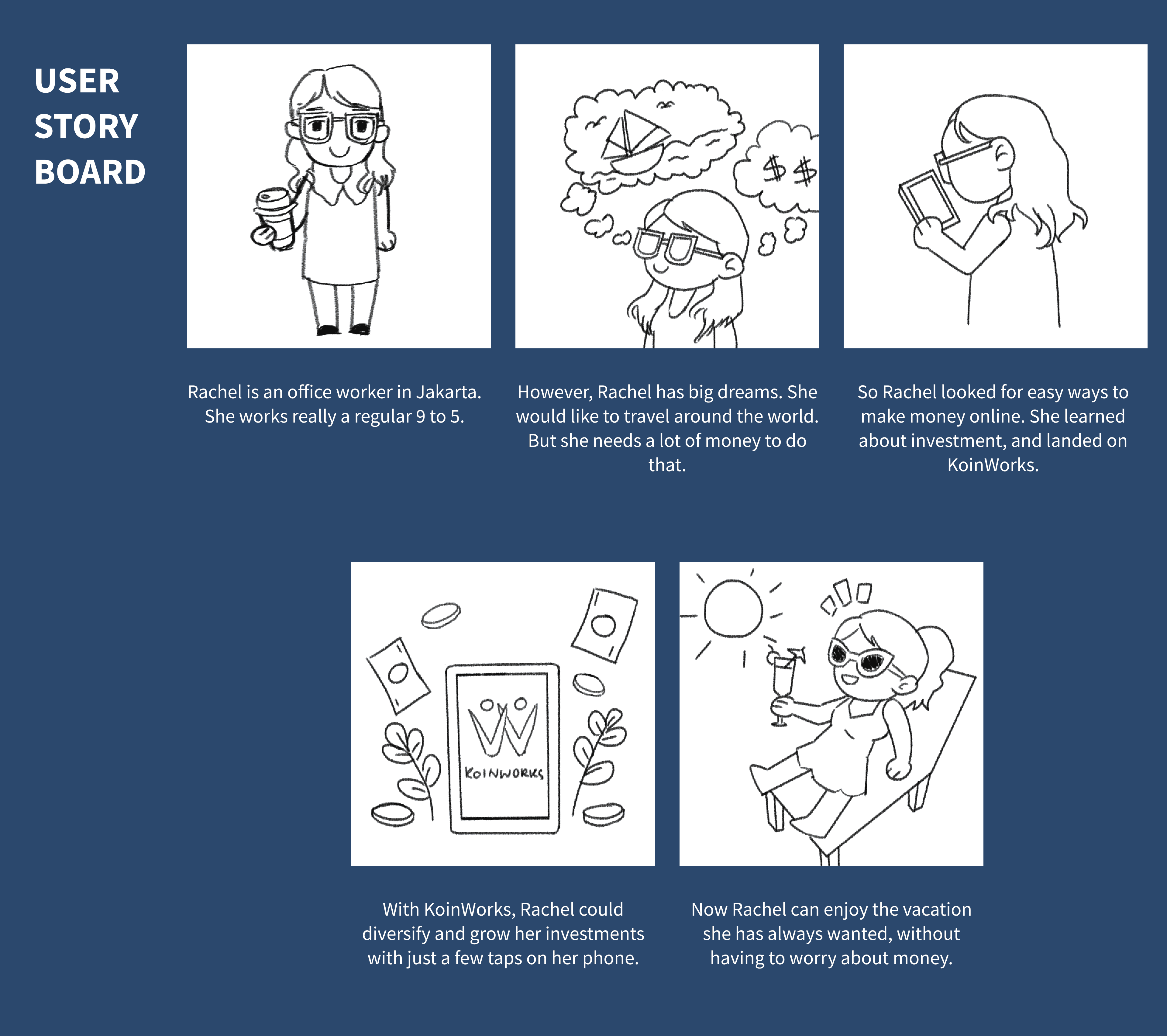
Using these tools, we are now ready to generate solutions.
We further reframed our design requirements into key actionable statements that are broad enough to allow multiple solutions, but narrow enough to set focus.
NOW, LET'S MOVE FORWARD WITH OUR APPROACH
Leveraging the key findings and persona attributes, I understood that the ideal solution lies at simplifying the app and minimizing margin of errors.
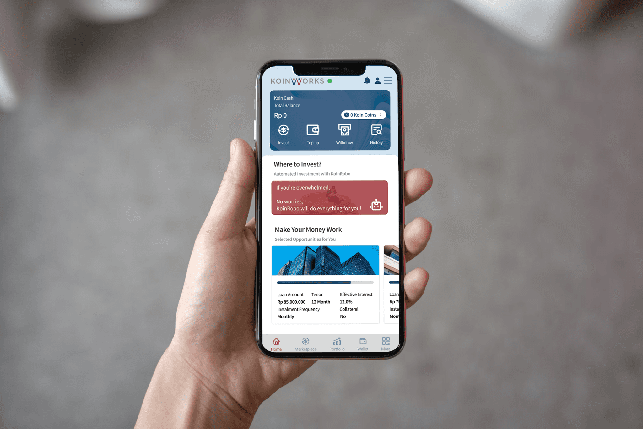
HERE COMES THE FINALIZED DESIGN
The final UI designs are the result of the process above. They are easy to use, look great, and make it simple to complete the tasks required for completion.
PROJECT TAKEAWAYS
This was my first encounter with UI/UX design and Figma. I used this opportunity to learn and implement design thinking to the best of my ability, and also gained hands-on experience using Figma to bring my ideas to life.
From this project I have also learned that it is important to keep things simple and streamlined, especially for a mobile app. A cluttered interface will only confuse users and lead to higher rate of misclicks. Sometimes, less is more.
THANK YOU FOR READING!
OTHER PROJECTS: